In today’s digital landscape, personal branding isn’t just about showcasing skills; it’s about creating a visual identity that speaks to who you are at your core. My favorite colors aren’t just hues I like; they’re reflections of my personality and style, integral to my branding journey.

Recently, I had the great opportunity to work with a Digital Marketing student from my college to create some personal branding products! This project is very near to my heart, as all the time and thought put into creating them truly reflects who “Rozy” and serves as a representation for the things I create. These logos and color schemes will be carefully incorporated into the website, which I am very excited for. Provided below is an explanation of the new designs as well as why we chose them.
The color scheme

My Digital Marketing student thoughtfully chose a new color scheme for my personal branding that deeply resonates with who I am and what I aspire to represent as Rozy. The rich “Dark Plum” is the starting point of the palette, embodying luxury and excellence, mirroring my passionate pursuit of high-quality standards in all my endeavors. “Wisteria”, the lively second shade of purple, represents the essence of creativity, reflecting my passion for innovation and the joy I find in imaginative expression! This is a very important aspect of the color scheme, because creativity is one of my most valued core values. The gentle hues of Lilac and Earthier Gold bring calmness, friendliness and authenticity to the mix, portraying a warm, approachable nature and my desire to always remain true to myself. Completing the palette, the Darker Gold reinforces a sense of approachability and comfort, ensuring that my personal brand not only stands out but also welcomes and resonates emotionally with others.
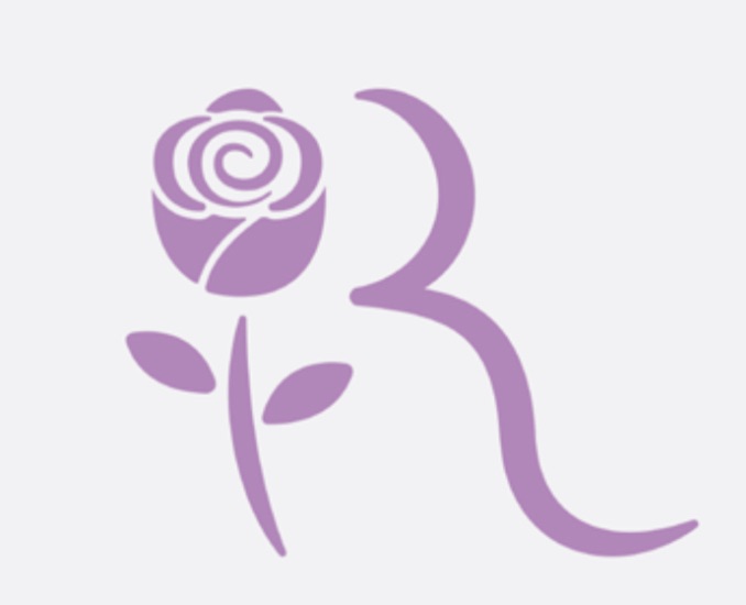
The new logo


Lastly, my DIGM partner and I have chosen a new logo for my personal branding that creatively incorporates the symbol of a rose, playfully echoing my name, Rozy, and encapsulating the essence of my identity. The design features smooth, rounded edges to shape the “R”, which not only give the logo a modern and accessible look but also signify my friendly and approachable nature. The gentle curves of the rose are meticulously crafted to represent elegance and luxury, reflecting the high standards and feminine touch I bring to my work. This blend of design elements in the logo communicates a sense of welcoming warmth while also conveying a refined and upscale feel. Overall, this logo perfectly balances professional appeal with personal charm, making it a true representation of my brand’s ethos.
I’m genuinely thrilled about the unveiling of my new personal branding content, which represents a significant step forward in my professional journey. The thoughtfully designed elements, from the colors to the logo, encapsulate everything I stand for and aspire to be. I am immensely grateful to my DIGM partner, whose creativity and expertise were instrumental in bringing this vision to life. Their dedication and insight have not only enhanced my brand’s visual identity but have also enriched my understanding of effective communication through design!
I hope you’re looking forward to seeing these design aspects on the website, just as I am excited to incorporate them!